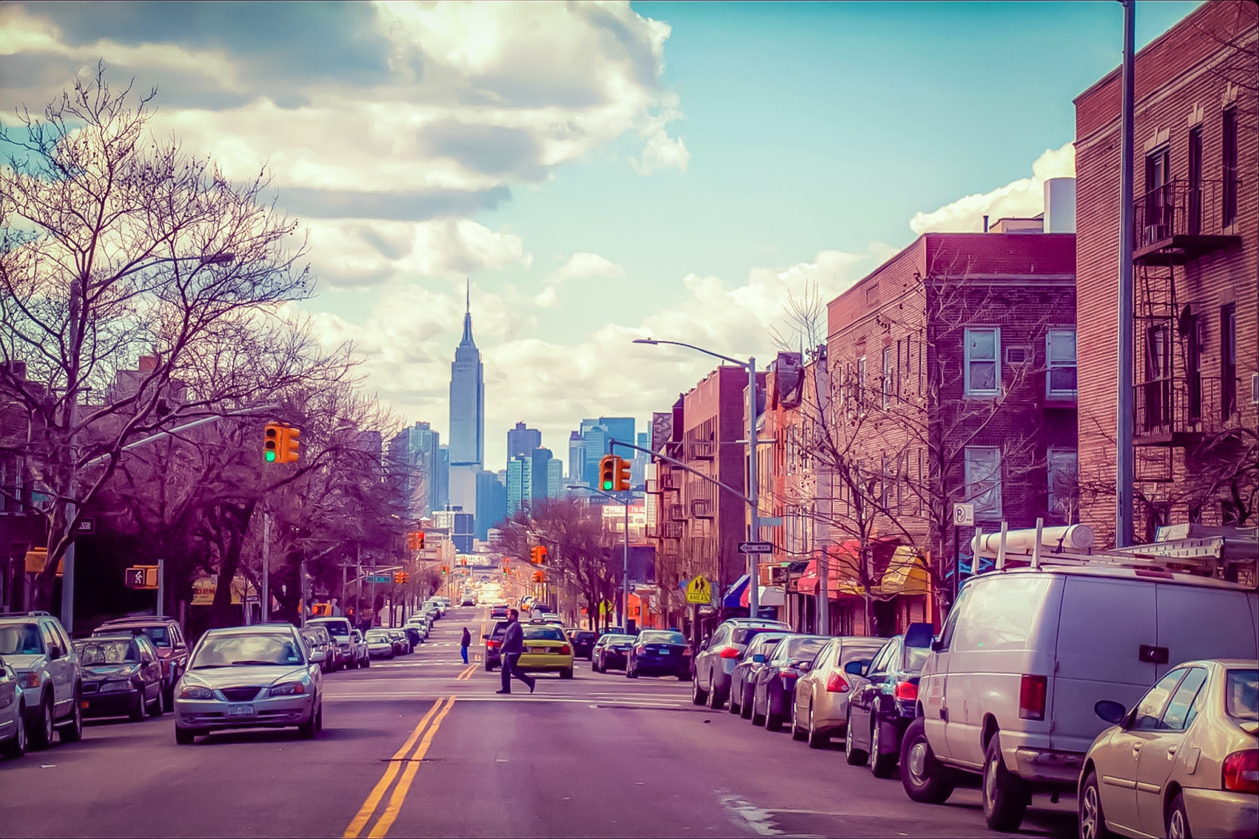
Tour of New York Back in the 1970s
By Lucas Compan
It's well known that the best soil for fine wine grapes is usually the least desirable for most other plants. This concept holds true for the logo I Love New York, created by Milton Glaser in the rocky soil of the 1970s: a decade of uncertainty, fiscal failure, and distrust.
But like the permanence of a fine vintage, I Love New York has thrived as one of the most widely seen, understood, and imitated identities of the twentieth century. For this reason, understanding the cultural context surrounding I Love New York is paramount in understanding its roots and ensuing success.
Let's kick off this fantastic visual story watching this short film about Milton Glaser, the creator of the famous I Heart NY symbol and his struggle to find love for the city in a trying time.
To help us all understand the context in which the logo was created, Dennis Cheatham – Professor of Graphic Design at Miami University in Oxford, Ohio – put together a wonderful piece of content called "The Logo No One Designed: A Historical Analysis of the I Love New York Logo", and we are sharing it with our readers. Thanks so much, Dennis!
Between 1969 and 1975, Americans suffered waves of disheartening news. The effects of a recession, political scandals and resignations involving the Vice President and President of the United States, a war-driven oil embargo, and stagflation piled up. At the crisis's apex in 1975, unemployment reached 8.9 percent, the highest since 1941. It's no wonder the popularity of disaster movies rose in the 1970s, acting as a mirror for the country's disposition.
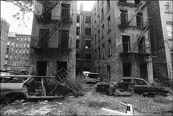
New York City's image fared even worse. The economic pitfall of poorly managed city finances and unchecked spending caused many municipal programs to be cancelled and many civil workers to lose their jobs. The lack of city codes (and pride) was evident by the “amount of dog shit on the street.”
Click of the photos below to compare these locations in the 1970s and today, thanks to google street view
Manhattan Bridge tower in Brooklyn, New York City, framed through nearby buildings, in June of 1974. Photo: Danny Lyon / National Archives and Records Administration. See this same spot today on Google Street View.

Despite warning signs, illegal dumping continues in this area just off the New Jersey Turnpike facing Manhattan in March of 1973. Photo: Gary Miller/NARA. See this same spot, now a park, on Google Street View.

Construction on Lower Manhattan's West Side, just north of the World Trade Center, in May of 1973. Photo: Will Blanche/NARA. See the same spot, now TriBeCa – an expensive area, on Google Street View.

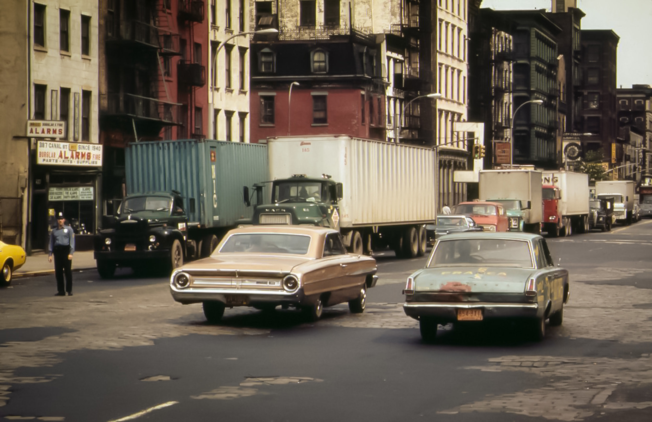
Holland Tunnel traffic, backed up on Canal Street, in May of 1973. Photo: Will Blanche/NARA. See this same spot today on Google Street View.
An oil slick surrounds Liberty Island in New York Harbor, in May of 1973. Photo: Chester Higgins/NARA
Idled traffic heading north on Sixth Avenue (Avenue of the Americas) near 42nd street, April 1973. Photo: Dan McCoy/NARA
Photos BELOW: Courtesy of FDNY Photo Unit


On the big screens
Even films of the period damned New York: Scorsese's Taxi Driver and Mean Streets, and William Friedkin's The French Connection were depictions of dangerous city, a place to avoid.Then came I Love New York. Glaser wrote of the logo's inception in his book Art is Work: “The state was about to embark on a new campaign to encourage tourism and to raise residents' spirits." New York was perceived as a crime ridden, unfriendly if not hostile location, and the campaign using the phrase "I Love New York," was intended to change that perception.
Robert DeNiro and Martin Scorsese (1976)
Tourists needed a welcoming ambassador and New Yorkers needed a reminder to be proud of their city.
The fact that the logo is visually cheery is a direct counter to the perceptions it was called in to battle. New Yorkers were uncertain of their city's future. Tourists didn't want to come to New York out of fear. The answer was a friendly, unassuming mark that employed a bright red heart to remind viewers of the love they'd lost. As Glaser noted in a 2003 interview with Chip Kidd inThe Believer, looking back 35 years, I Love New York doesn't look like anyone designed it.
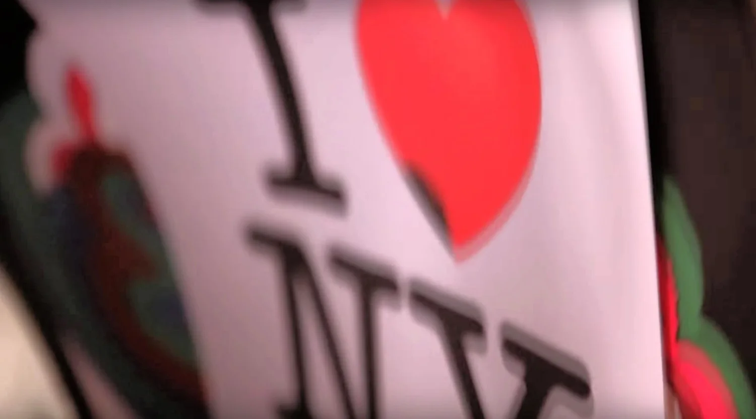
The iconic logo designed by Milton Glaser
Today, the logo feels so normal because it's been used and abused and plastered on everything from oven mitts to stickers. But to New Yorkers and potential tourists in the 1970s, Glaser's mark was fresh and surprising, inviting a viewer to play its game. At first blush, the letterforms with the emblazoned red heart come together to get the viewer's attention. By using iconography that‟s understandable, specifically the letters “I” and “NY” and the symbolic heart, viewers can “read” the logo quickly.
This treatment makes a very bold statement but the heart‟s contrast using color highlights the “heart” of the message. It's unmistakable that the communication of the mark is about love.By using the typeface American Typewriter (created in 1974 by Joel Kaden and Tony Stan) the letterforms are easy to read, but also friendly because of the face‟s rounded, unassuming, curved serifs.
Anyone in the 1970s would have known the look of typed text from a typewriter. The choice of type enhances its familiar and friendly tone, grounded in the relevancy of the day‟s technology and presenting itself as if a letter from a friend. As a whole, I Love New York is nothing more than a simple puzzle, visually held together as a square gestalt. Technically, its construction allows it to be placed in a variety of materials and promotions quickly, even vertically without loss of effect. And the fact that the logo is a puzzle engages viewers in solving it, and by doing so is remembered more easily because of the activity. The construction of the mark is the key to its strength. While its good rendering is engaging and lighthearted, the viewer has to interact with it to complete the puzzle. Like sitting down with friends to do a jigsaw puzzle, Glaser essentially invited down-on-their-luck New Yorkers to play with him, with hopes they would move from being indifferent about their city to “we love this place.”
I Love New York is considered to be the first and most effective effort to brand a city. To potential tourists who were considering a trip to the Big Apple, a concerted, simple, fun brand for the city showed that New York was consciously working to change its image. To New Yorkers, this was a message that their city was a place of which to be proud. As a whole it was an experiment on how a brand can drive internal and external perceptions of a municipality as a catalyst for change.
Milton Glaser photographed by Sam Haskins and the 'I Love NY' logo he designed
One uniquely visceral and iconic medium that was used in the campaign was the button. When one wears a button, they are participating in the brand. That person has believed enough in the content of the item to go to the length of wearing it and making it part of who they are and what they believe. Quite literally, the wearer would be standing behind the message, saying “I LoveNew York,” revealing a sense of belonging. This wearing also translates to visitors, who would bring the inexpensive token back with them to wear for others to share in the message (and the belief of that message).The brand was also used in television advertising, which was especially relevant for reaching the tourist population New York sought.
Sewell Chan of the New York Times Blog: City Room, interviewed Miriam Greenberg, the writer of Branding New York: how a city in crisis was sold to the world, where she commented on the television campaign:
“They used great local talent—the creative advertising firm Wells, Rich, Greene and the designer Milton Glaser—to design the logo, TV ads that featured members of great musicals on Broadway, emotional appeals with cast members staring straight into the camera.
Frank, bold, friendly, I Love New York was a concerted appeal. It was a comprehensive branding campaign that used a consistent look, appearing in a variety of materials. This deliberate effort strived for brand equity, but opposed to many corporate brands; a key desired effect was belief
In the case of I Love New York, the logo popped up repeatedly, enforcing the message thatNew York would survive the challenges of the decade, and it wouldn't hurt if plenty of visitors came to the city to help rebuild with their tourism dollars. By 1975, New Yorkers were keenly aware of the reasons for their city‟s failings. The city‟s debt had been mounting for years and officials had been spending irresponsibly for decades. New York offered such widespread services to its residents that the budget swelled beyond that of entire nations. So when New York was in dire straits in 1975, numerous services were cut and as a result, many municipal jobs. In a drastic response, New York Police urged tourists and residents not to walk the streets after six p.m. and began referring to the city as “fear city.”
I Love New York was a friendly image created to combat the fear perceptions that had plagued the city and the lack of pride that was prevalent. Many New Yorkers had lost their affection for their city and in response I Love New York was happy, with love at its core. Glaser was simply fighting hate, apathy, and hopelessness with love.To the nation, New York was a place to be avoided. An example of this perception was a newspaper advertisement for the airline Alitalia in 1971 that depicted the Statue of Liberty with a tear running down her eye and the phrase “Announcing the Beginning of the end of New York City.”
The campaign was calling attention to Alitalia's new service to neighboring cities but was understandably frowned upon by tourism officials. In response to the “avoid” attitude of the nation, I Love New York reached out to tell them that they were welcome and that New York was friendly and that New Yorkers themselves liked it there. The logo and larger campaign were a combined effort to tell potential visitors that there was love in the city. The response was clearly effective: in following years, tourism became the city's second largest industry, with 834 conventions held there.
Understanding the influences for I Love New York help us to understand its context and creative lineage. While the logo seems to have come from “nowhere,” there are roots showing beneath the surface that reveal its underpinnings.
I Love New York is a rebus: a puzzle that has to be interpreted to be understood. The notion of using a puzzle to communicate isn't a new one. Early Egyptian scribes would use a rebus to express ideas as early as 3100 B.C. These hieroglyphics combinations of pictures to create sounds were used to communicate concepts that couldn't be easily contained by single pictographs.
As a method of communicating with his audience most effectively for the goal of being easily remembered, the rebus was aptly chosen, as proven by how memorable a mark it has remained. As mentioned earlier, buttons are powerful items, packed meaning. In 1969, the advertising agency Young & Rubicam created a campaign identity for the New York Urban Coalition that was as broad as I Love New York in media use, but its power was also on the button. One newspaper ad would invite people to donate to the organization to receive an all-type black button with white type that read: “Give a damn.”
This campaign called on emotion, challenged New Yorkers to care, and if they did, to show it. The phrase “Give a damn.‟ was the hallmark of the campaign, like I Love New York, and both used the button to make the content intensely personal.
I Love New York is a feeling and a brand. It endears, it‟s frank, and to say it plainly, it has made a lot of money. The mere fact that it Glaser produced it for free is an example of how design can change the culture when designers care enough. It's a pretty good story for the logo no one designed. 'Give a damn' campaign, created by Stephen O. Frankfurt, working at the time at Young & Rubicam in New York.
"Give A Damn" campaign – This campaign called on emotion, challenged New Yorkers to care, and if they did, to show it. The phrase “Give a damn.‟ was the hallmark of the campaign, like I Love New York, and both used the button to make the content intensely personal
The man behind the logo
Milton Glaser, the designer of iconic logo I Love New York
Graphic designer Milton Glaser didn’t make much money off of his work for the iconic campaign, but he doesn't mind one bit.
“I was paid $2,000 for execution and mechanical costs of doing it, but that was the only money I ever made off of it,” he told HuffPost Live host Ricky Camilleri. “And I was very happy to do it. I was very happy about the consequences.”
The logo was first used in 1977 as part of the city’s push to boost tourism during some of the Big Apple’s darkest days, and now it appears on mugs, shirts, hats and any souvenir that can fit the design.
“It was a time where people were streaming out of the city,” Glaser said. "Everybody was moving out because it had become so dark and dangerous to be here. And then they started the campaign. It was certainly only one of many, but it was the most visible and most powerful symbol of a shift in consciousness. And the fact that I had something to do with it makes me very, very happy."
“I was paid $2,000 for execution and mechanical costs of doing it, but that was the only money I ever made off of it, And I was very happy to do it. I was very happy about the consequences.”
From 1997 to 2016 we have seen so many changes in the city that never sleeps. One thing seems to be working well, though tourism. In 2015 alone, almost 60 million tourists were visiting the Big Apple. The influx of visitors has been growing steadily since the recession ended, consistently surpassing the goals set by city officials. The impact of tourism on the city’s economy has been increasing, too. NYC & Company, the city’s tourism promotion agency, estimated that tourism spurred $61.3 billion in economic activity last year.
Almost 40 years later, we can see how powerful a logo can be. Of course, it was part of a wider strategy with so many parts involved. However, it just shows us the power that three letters, one heart, and a big dream could have.
We love New York. We love big dreams.
In November 2014, UK-based artist Nick Walker metaphorically set his name on fire with his solo exhibition in New York City. That excellent show featured a new body of work that impressed visitors indoors at a Soho pop-up gallery space. To follow that up, Mr. Walker made sure the good folks of NYC also got a taste of his work outdoors with his iconic Love Vandal (covered) character. This large mural, which was located off 17th street & 6th avenue in a parking lot, caught the hearts and attention of many New Yorkers. Photo: lucas Compan